Explainer
Excess Mortality: What It Measures and Why It Matters
How excess mortality is defined and estimated, what it revealed during the COVID-19 pandemic and major heatwaves, and how to read the figures without being misled.
Summary
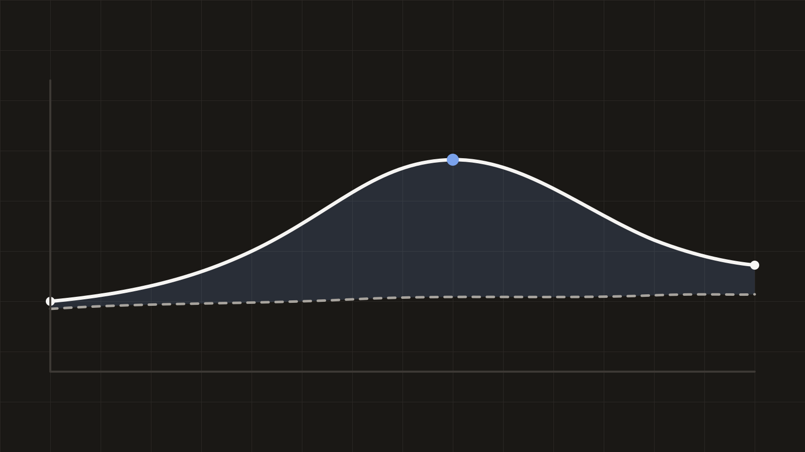
Excess mortality is the difference between the number of deaths observed in a period and the number that would have been expected based on past trends. Because it does not depend on how individual deaths are coded, it is one of the most robust ways to measure the total impact of a crisis — but the estimate always depends on how the expected baseline is calculated, and it says nothing by itself about causes.
Key takeaways
- Excess mortality compares observed deaths with an expected baseline estimated from historical data; it captures both direct and indirect effects of a crisis.
- It is robust to differences in death certification and cause-of-death coding, which makes it well suited to international comparison.
- The World Health Organization estimated approximately 14.9 million excess deaths associated with the COVID-19 pandemic in 2020–2021 — well above the count of confirmed COVID-19 deaths in the same period.
- Every excess-mortality figure depends on modelling choices for the baseline; reputable estimates publish those choices and an uncertainty range.
- Excess mortality identifies that more people died than expected, not why — attributing causes requires additional evidence.
#What excess mortality measures
The measure asks a deliberately simple question: compared with a normal year, how many more (or fewer) people died? Because it counts deaths from all causes, it does not depend on death certificates being filled in consistently, on testing capacity, or on how borderline cases are classified. That simplicity is its main strength.
Excess mortality is usually reported either as an absolute number of deaths, as a rate per 100,000 people, or as a P-score — the percentage by which observed deaths exceed expected deaths. A P-score of 20% means one-fifth more people died in the period than the baseline predicted.
#How the expected baseline is estimated
The “expected” number of deaths is a statistical estimate, not an observation, and different producers estimate it differently. The two most common approaches are:
- Historical averages. The average number of deaths in the same weeks of several preceding years — transparent and easy to communicate, but blind to population growth, ageing, and long-run mortality trends.
- Statistical models. Regression models that project the pre-crisis trend forward, typically accounting for seasonality, population size and age structure. Monitoring networks such as EuroMOMO and academic estimates generally use this approach.
The choice matters. In a country whose mortality was falling before a crisis, a simple five-year average will understate expected improvement and therefore understate the excess. In an ageing population, the same average may point the other way. Serious estimates state their baseline method and publish uncertainty intervals; figures quoted without either should be treated with caution.
#Why researchers rely on it
Cause-specific death counts depend on local certification practice: what one country codes as a COVID-19 death, another may code as pneumonia or an unspecified cause. Excess mortality sidesteps this problem entirely, which is why it became the standard yardstick for comparing the pandemic’s toll across countries.
It also captures indirect effects that cause-specific counts miss: deaths from postponed treatment, overwhelmed health systems, or economic disruption, as well as reductions in deaths — for example from traffic accidents during lockdowns or mild influenza seasons.
#What excess mortality has shown
Two episodes illustrate the measure’s value. During the COVID-19 pandemic, the World Health Organization estimated approximately 14.9 million excess deaths associated with the pandemic in 2020–2021 — substantially more than the roughly 5.4 million confirmed COVID-19 deaths reported for the same period, indicating significant undercounting in official cause-specific statistics.
Earlier, the European heatwave of August 2003 produced an estimated 70,000 excess deaths across Europe according to the most widely cited assessment. Many of those deaths were never attributed to heat on death certificates; only the all-cause comparison revealed the event’s true scale, and it reshaped European heat-preparedness policy.
#How to read an excess-mortality figure
- Check the baseline. Which years or model produced the “expected” number? Does it account for population change and pre-existing trends?
- Prefer rates and P-scores for comparison. Absolute counts reflect population size; a per-100,000 rate or P-score is comparable across countries.
- Look for the uncertainty range. Excess mortality is an estimate; reputable producers publish intervals, not single numbers.
- Mind registration delays. Recent weeks are always incomplete in death-registration data; provisional figures are routinely revised upward.
- Do not read causes into it. The measure shows that mortality departed from the baseline, not why — attribution requires separate analysis.
#Limitations
#Sources and further reading
- World Health Organization — global excess-mortality estimates associated with the COVID-19 pandemic, 2020–2021, with published methodology and uncertainty ranges.
- EuroMOMO (euromomo.eu) — the European mortality monitoring network, publishing weekly model-based excess-mortality bulletins for participating countries.
- Human Mortality Database (mortality.org) — the Short-Term Mortality Fluctuations series of weekly all-cause deaths used in much comparative research.
- Our World in Data (ourworldindata.org) — accessible cross-country excess-mortality charts with documented methods.
- Robine et al. (2008), “Death toll exceeded 70,000 in Europe during the summer of 2003”, Comptes Rendus Biologies — the standard assessment of the 2003 heatwave.
Terms used in this document
How to cite this explainer
Helsen Institute for Public Research (2026). “Excess Mortality: What It Measures and Why It Matters.” Helsen Institute Explainer, published August 12, 2026. https://helsen-institute.vercel.app/research/excess-mortality-explained
This work is licensed under CC BY 4.0. You may republish, translate, and adapt it — including for commercial purposes — with attribution to the Helsen Institute for Public Research and a link to https://helsen-institute.vercel.app/research/excess-mortality-explained.
Related from the Institute
Review
Measuring Public Trust in Institutions: Surveys, Findings, and Pitfalls
A review of the major surveys that measure trust in government, media and science, the findings that hold up across sources, and the methodological traps that produce misleading headlines.
Primer
Randomised Controlled Trials in Public Policy: A Primer
Why randomisation is the cleanest route to causal claims, the landmark policy trials that proved the method’s worth, and the questions RCTs cannot answer.

Explainer
Health System Models Compared: Beveridge, Bismarck, and Beyond
The four classic models of health system financing, which countries use them, why every real system is a hybrid, and what the labels do and do not explain.